
Why your gallery wall looks cluttered, and how to fix it
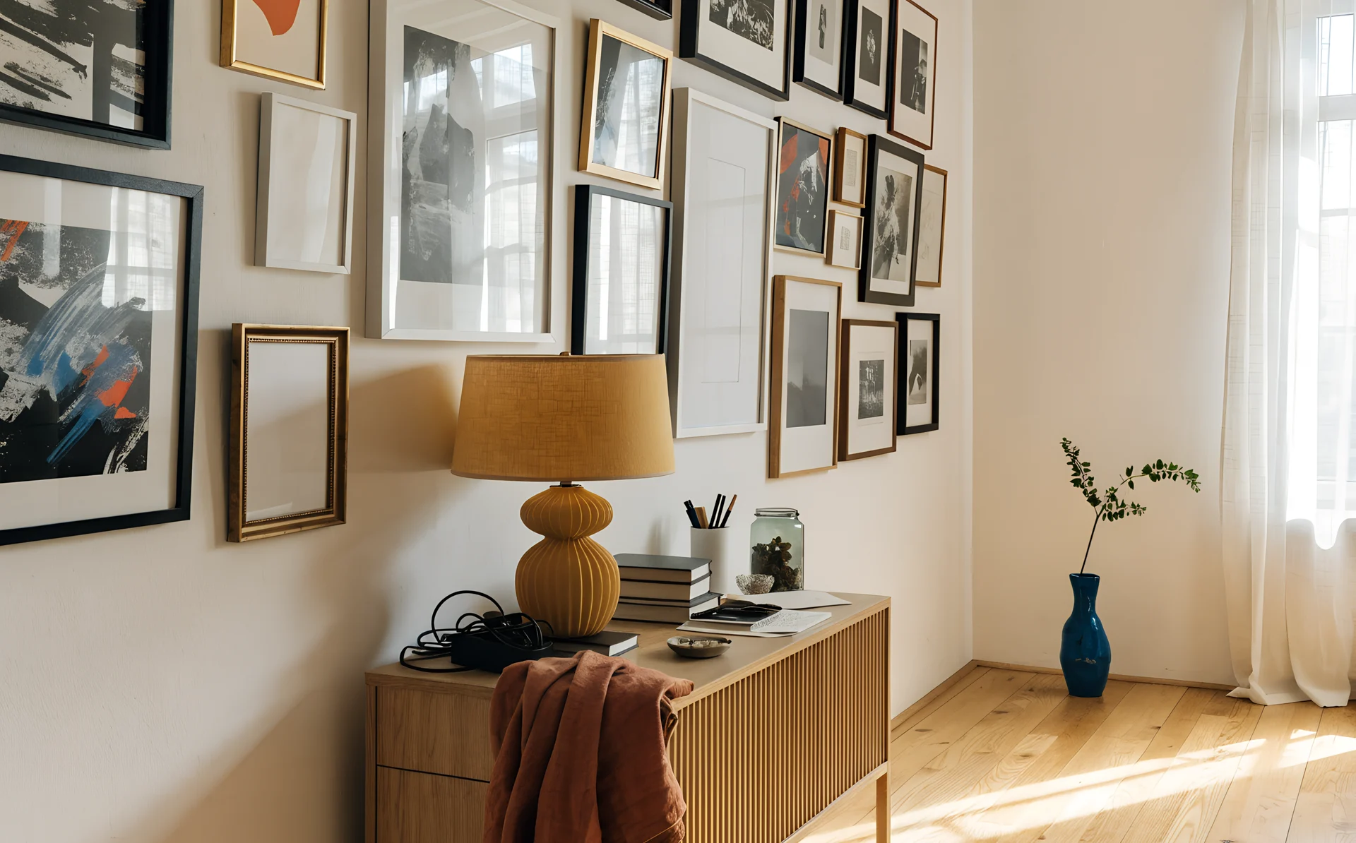
Your gallery wall looks cluttered for one of six fixable reasons: uneven gaps, no shared alignment line, too many competing focal points, mismatched frames, the wrong scale for the wall, or too much subject variety. The fix is almost never adding or removing pieces. It is making the pieces you have read as one shape instead of scattered bits. Find your specific problem below and the exact fix for it.
A cluttered wall often comes from committing the arrangement to the plaster too early, before anyone checks whether it holds together. Each section names one cause, gives the fix, and points you to the post that covers the mechanics in full.
How do I know if my gallery wall actually looks cluttered?
Step back about 2 metres (6.5 feet), squint until the frames blur, and check whether the group reads as one tidy block or as random scattered pieces. If it dissolves into bits, the wall is too busy. The squint test removes detail and leaves only the overall shape, which is what a visitor's eye registers first.
There is a second, harder test. The stylist Emily Henderson recommends judging your own home as if it belonged to someone else: "Pretend it's not your house and that you have no emotional connection to it." You hung these frames, so you forgive their flaws, while a first-time visitor reads them cold. Run both tests before you change anything, because together they tell you whether you have a real problem or just cold feet.
My gallery wall has uneven gaps. How do I fix it?
Inconsistent spacing is the most common reason a gallery wall looks messy, and it is the easiest to miss. When the gap between frames varies, wider here and tighter there, the eye reads the difference as a mistake rather than a choice. The fix is to pick one gap measurement and keep it identical between every pair of neighbouring frames.
The widely cited gap is 2 to 3 inches (5 to 7.5 cm), but the exact number matters far less than holding it steady across the whole wall. For how to measure and set a consistent gap, and what to do around corners and furniture, see our guide to gallery wall spacing.
My frames feel like they are floating. How do I give them structure?
Anchor the whole group to one shared line and the floating stops. Choose a top baseline, a horizontal centre line through the middle of the arrangement, or a tidy outer rectangle that the frames sit inside, then make every frame relate to it. Without a shared line, a viewer's eye has nothing to hold and the wall reads as noise.
Pick one of these three alignment strategies and commit to it:
| Alignment strategy | Use it when |
|---|---|
| Top line: every frame's top edge sits on one horizontal | You want a crisp, formal row |
| Centre line: one horizontal runs through the vertical middle, frames balanced above and below | Your frames are mixed sizes |
| Outer rectangle: the outermost edges form a clean rectangle or square | You have a busy salon-style cluster |
With any one of these in place, even a wall of fifteen different frames looks intentional rather than accidental.
My gallery wall has no clear focal point. How do I anchor it?
Choose one anchor piece, usually the largest or the darkest, place it slightly off-centre or at eye level, then balance the lighter pieces around it. When several pieces compete for attention at equal strength, nothing wins and the wall feels chaotic, so one clear anchor settles the whole arrangement.
Visual weight is how heavy a piece feels, not how big it measures. A small black-and-white photograph in a thick dark frame can carry as much weight as a print three times its size in a thin pale frame. You balance a wall by feel: one heavy anchor on one side, answered by a cluster of smaller, lighter frames on the other. The two sides should not match, but they should weigh about the same. Our asymmetric layout guide walks through this visual-weight method in detail.
My frames do not match. Does that make a gallery wall look cluttered?
Mixed frames only look cluttered when nothing ties them together. Three finishes, two metals and a raw wood frame on one wall pull the eye in too many directions. The fix is to repeat one unifying element: a single frame finish, a single mount colour, or a single colour treatment applied to the art inside.
You have two reliable routes to cohesion here. The first is to unify the frames: pick one finish, all black, all natural oak or all brass, and let the art vary. The second is to unify the art: if the photographs themselves clash, converting them all to black and white removes the colour conflict and lets mismatched frames read as a set. The colour-treatment decision is worth thinking through on its own, which is why we wrote a full guide to black and white versus colour family photos. You rarely need to unify both at once, so choose whichever is easier with the pieces you already have.
My gallery wall is the wrong size for the wall. How do I scale it?
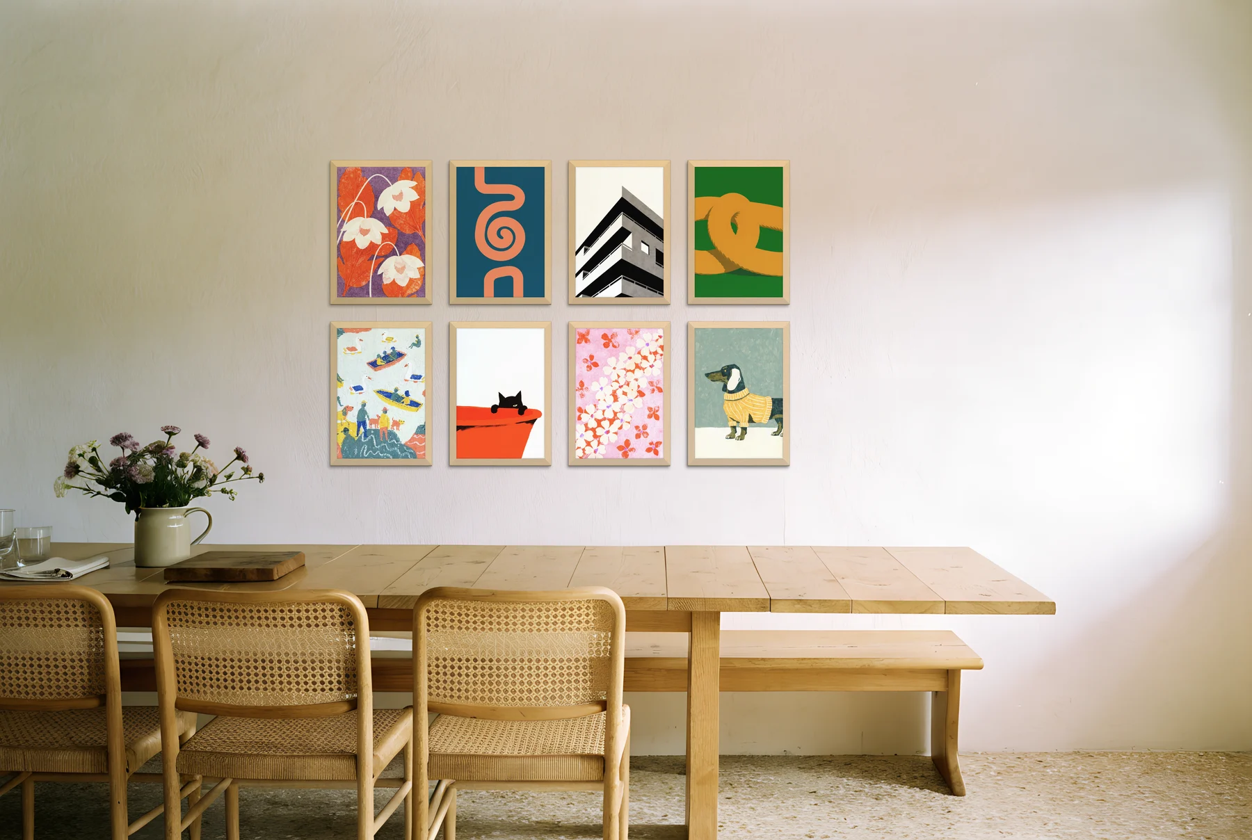
Size the whole arrangement to span roughly 66 to 75% of the width of the furniture beneath it, whether that is a sofa, a bed, a sideboard or a console table. A group that is too small for its furniture looks lost and accidental; one that is too big looks like it is bursting out of the space. The furniture, not the wall, sets the target.
For how many frames hit that span and which dimensions to choose, our guide to gallery wall sizes has the full method and the source behind the 66 to 75% rule.
Too many different subjects. How do I make a gallery wall look cohesive?
Give the wall one organising thread so a visitor can sense what it is about: group by theme, by colour palette, or by treatment. When a wall mixes landscapes, portraits, typography, abstract prints and holiday snaps with no through-line, the variety itself becomes the clutter.
A through-line does not mean every piece is identical. It means there is an answer to "what connects these?" That answer might be a shared subject, such as all coastal or all family. It might be a shared palette, where everything sits in warm neutrals or in blues and greys. Or it might be a shared treatment, such as all black and white or all framed in oak. Choose the thread first, then audit every piece against it and move anything that does not belong elsewhere in the home. This is the cohesion lever most people skip, and it is often what separates a wall that looks collected from one that looks like a pile-up.
The six causes, the quick fix, and where to read more
| Cause | Quick fix | Read more |
|---|---|---|
| Uneven gaps between frames | Pick one gap and keep it identical everywhere (commonly 2 to 3 in / 5 to 7.5 cm) | Setting a consistent gap |
| No shared alignment | Align to a top line, centre line, or outer rectangle | The visual-weight method |
| Too many focal points | Set one anchor piece, balance visual weight around it | Asymmetric layouts |
| Mismatched frames | Repeat one finish or colour, or convert art to black and white | Black and white versus colour |
| Wrong scale | Span 66 to 75% of the furniture width | Sizing for the wall |
| Too much subject variety | Group by theme, colour, or treatment | Inspiration by room and style |
Test the fix before you re-drill
A cluttered wall often comes from committing too early: frames go up, gaps drift, nothing aligns, and by the time you step back you have a wall full of holes you do not want to repeat. The cheaper route is to rearrange on a photo of your actual wall first, so you can test a new gap or a new anchor before a single fresh hole goes in. Curate's gallery wall planner lets you do exactly that, dragging your prints around on a photo of your own wall until the squint test passes. Diagnose the cause, try the fix on screen, then hang once.
Frequently asked questions
Why does my gallery wall look messy even though I like every piece?
Liking each piece individually is not the same as the group working together. A wall looks messy when the pieces lack a shared gap, a shared alignment line, or a single anchor, so the eye reads them as scattered rather than as one arrangement. Fix the relationships between the frames, not the frames themselves.
What is the most common reason a gallery wall looks cluttered?
Inconsistent spacing. When the gap between frames varies across the wall, the eye reads the unevenness as a mistake. Setting one consistent gap, commonly 2 to 3 inches (5 to 7.5 cm), is the highest-impact single fix.
How do I make a busy gallery wall feel calmer without taking pieces down?
Give it a through-line. Group the existing pieces by a shared theme, colour palette, or treatment, and align them to a tidy outer rectangle. Converting clashing photos to black and white is a fast way to unify mixed art without removing anything.
What is the squint test for a gallery wall?
Step back about 2 metres (6.5 feet) and squint until the frames blur. If the group reads as one tidy shape, it is cohesive; if it dissolves into random bits, it is too busy. Squinting strips away detail and shows you the overall shape a visitor sees first.
Should I fix a cluttered wall by removing pieces?
Usually not. Most cluttered walls come from uneven gaps, weak alignment or no anchor, not from too many frames, so start by fixing those relationships. Remove pieces only when the subjects still compete after you have set a consistent gap and a clear anchor.
Find your cause above, apply the one fix that matches it, then test the result on a photo of your wall before you pick up the drill.