
How to balance an asymmetric gallery wall by visual weight
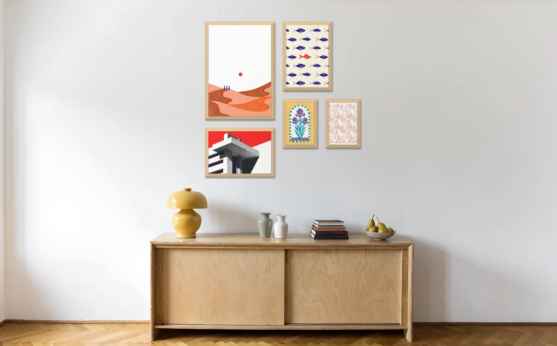
An asymmetric gallery wall is an off-centre arrangement of frames that still feels balanced. You spread the visual weight evenly across the wall instead of mirroring identical pieces around a centre line. The repeatable move is to balance one large frame on one side with a cluster of smaller frames on the other, then anchor everything to a shared line so the imbalance reads as deliberate.
Visual weight is not a matter of taste or luck. It follows a few rules you can apply on purpose, and once you can see weight, an uneven wall stops being the hardest layout to pull off and becomes one of the easiest.
What is an asymmetric gallery wall?
An asymmetric gallery wall is an intentionally off-centre arrangement of frames that still feels settled, because the visual weight on each side is roughly equal even though the pieces are not. It is neither a mirror image nor a tidy grid. You are balancing unequal elements, so the wall reads as dynamic and casual.
Think of a seesaw. A symmetrical layout puts identical twins on each end at equal distance, so it balances by default. An asymmetric layout puts one heavy person near the middle and two lighter people further out, and it still sits level. The pieces differ; the balance holds. That is the entire principle behind an asymmetrical gallery wall layout, and it is why the style suits real rooms, where you rarely own two of everything.
How is it different from a symmetrical or salon wall?
An asymmetric layout balances unequal pieces by visual weight; a symmetrical layout mirrors identical pieces around a central axis; a salon wall fills a space densely with mixed sizes and frames. Asymmetric is the one defined by deliberate imbalance, and it can be sparse or dense where a salon wall is always packed. A shared baseline or edge line is what keeps an off-centre gallery wall from tipping into a mess.
Here is how the three compare at a glance.
| Layout | Core idea | Balance comes from | Best for | Density |
|---|---|---|---|---|
| Symmetrical | Mirror image around an axis | Matching pairs at equal distance | Formal, traditional rooms | Even, controlled |
| Salon | Dense, eclectic, floor-to-ceiling feel | Sheer fullness and edge alignment | Maximalist, collected looks | High |
| Asymmetric | Off-centre but settled | Equal visual weight, not matching shapes | Modern, casual, awkward walls | Sparse or dense |
| Grid | Identical frames in even rows | Repetition and consistent gaps | Clean, minimal, photo sets | Even |
If you want the full menu of styles and a way to choose between them, start with the gallery wall layouts pillar, which covers the symmetrical and matched-pair approach too. This page goes deep on asymmetry alone.
When should you use an asymmetric layout?
Choose an asymmetric layout when your room is modern or casual, when your wall has an obstacle, or when your pieces will not split evenly. It is the most forgiving layout for real-world walls, because the absence of a centre line means a light switch, a sloped ceiling, or furniture that sits off to one side stops being a problem.
It suits three situations in particular:
- Dynamic, modern, casual rooms. A perfectly mirrored wall can feel stiff in a relaxed space. Off-centre weight adds movement.
- Awkward walls. A wall with a light switch, a radiator, a sloped or staircase ceiling, or art that has to sit off-centre above a sofa. Asymmetry absorbs the obstacle instead of fighting it. With a radiator, keep the frames beside it rather than above it, where rising heat can warp frames and cockle paper.
- Odd-numbered or mismatched sets. Five prints, or a 24 inch (61 cm) piece next to three small ones, will never form a tidy pair. An unbalanced gallery wall arrangement turns that into a feature.
How do you balance visual weight on a gallery wall?
You balance visual weight by reading which elements feel heavier and counterweighting them across the wall. Larger frames, darker images, bolder colours, and thick or dark mounts all carry more weight. The repeatable move is to put one big or dark piece on one side, balance it with a cluster of smaller, lighter frames on the other, then anchor everything to one shared line.
What makes one piece feel heavier than another?
A piece gains visual weight from size, from dark or high-contrast content, from saturated colour, and from a heavy frame or a wide mount. A small print in a black box frame can outweigh a larger pale watercolour in a thin frame. You are not measuring centimetres here. You are judging how much each piece pulls the eye.
Use this table as a quick reference when a wall feels lopsided.
| Heavy element | Why it pulls the eye | How to counterbalance it |
|---|---|---|
| One large frame | Dominates by sheer size | A cluster of 2 to 4 smaller frames on the opposite side |
| A dark or high-contrast image | Reads as visually dense | A second darker piece across the wall, or a tight group of mid-tone prints |
| A bold pop of colour | Draws the eye instantly | Echo that colour once more on the far side to share the load |
| A thick or black frame | Adds perceived mass | Repeat one heavier frame elsewhere so it is not stranded |
| A piece floating high and alone | Top-heavy, looks unanchored | Drop nearby pieces to a shared baseline to settle the group |
How do you anchor the arrangement?
Pick one strong line and align to it: a shared bottom baseline, a common top edge, or a central horizontal that runs through the middle of the group. The anchor line is what tells the eye the imbalance is on purpose. Without it, an off-centre layout looks like an accident. With it, the same frames look composed.
A shared bottom baseline is the most reliable choice for a beginner. It mimics how objects sit on a shelf, so the eye trusts it instantly.
Worked example: balancing one big piece against four small ones
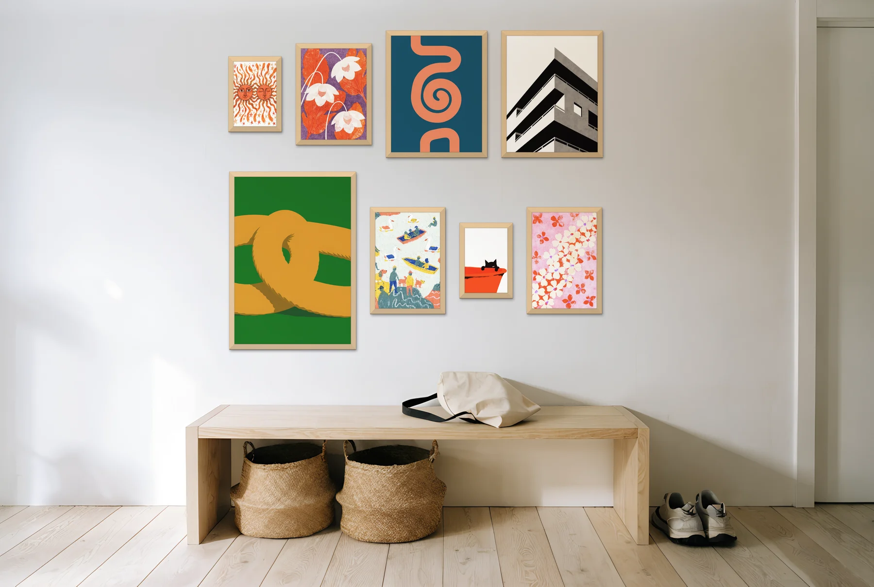
Here is a layout you can copy. Place one 24 x 36 inch (61 x 91 cm) piece on the left. On the right, build a 2 x 2 cluster of four 11 x 14 inch (28 x 36 cm) frames. Keep a consistent gap between the four small frames and line the whole arrangement up along one shared bottom baseline.
The single large piece and the four-frame cluster carry similar visual weight, so the wall feels balanced even though the left and right sides hold completely different things. Swap the 24 x 36 inch (61 x 91 cm) piece for a darker image and you may want only three small frames opposite, since the dark piece now carries more weight on its own.
How many frames and how much spacing?
Most asymmetric walls use 3 to 9 frames, with a consistent gap of 2 to 3 inches (5 to 7.5 cm) between them. An odd total often makes balancing easier, because there is no natural pair pulling you back towards symmetry. The consistent gap is what holds a varied set together, so the eye reads the arrangement as deliberate rather than random.
Spacing is one of the most common things people get wrong on any layout, so it is worth getting right once. For the full reasoning, the edge cases, and how to adjust the gap for very small or very large pieces, see the gallery wall spacing guide.
For how many frames and what sizes suit your wall, including the rule that a gallery wall should span 66 to 75% of the furniture beneath it (a guideline from MontCarta), see the gallery wall sizes guide. For hanging height, the centre of the arrangement usually sits around 57 inches (145 cm) from the floor. The full method, including the staircase slope rule, lives in the guide to how high to hang a gallery wall.
How do you handle awkward walls with asymmetry?
Asymmetry is the layout that handles obstacles gracefully, because it has no centre line to protect. Off-centre above a sofa, beside a staircase, or wrapping around a TV, you let the obstacle define one edge of the arrangement and balance the weight on the open side. The constraint becomes the composition.
A few common cases:
- Above a sofa, but off to one side. When the sofa is not centred on the wall, do not force the art to centre on the sofa. Anchor the heaviest piece over the sofa and let lighter frames trail towards the open wall. If that piece is large and glazed, hang it on two secure fixings, because it sits above people's heads.
- Beside a staircase. Step the frames to follow the slope rather than holding a flat top line. The dedicated stairway layout covers the geometry in full.
- Around a TV. Treat the screen as one heavy black rectangle and balance real frames around it, weighting the side that needs to fill more wall. An L-shape or a loose surround works better than a forced symmetrical frame.
Visual weight is far easier to judge when you can see it than when you picture it in your head, so it helps to test the balance on a photo of your actual wall before you put a single nail in. Curate lets you arrange your prints and frames on a photo of your wall and preview the result, including in AR on your phone, so you can see whether the two sides truly balance before you commit. If a hole-free approach matters, pair the test with the no-nails hanging guide.
When you are ready to map the whole thing out physically, the floor-layout and paper-template method is the safest way to transfer your plan to the wall. That full step-by-step lives in the guide to planning a gallery wall.
Frequently asked questions
What is an asymmetric gallery wall?
It is an off-centre arrangement of frames that still feels balanced, because the visual weight is spread evenly across the wall rather than mirrored around a centre line. You balance unequal pieces, such as one large frame against several small ones.
How do you start an asymmetric layout from scratch?
Pick your heaviest piece first and place it off to one side, then build a cluster of smaller frames on the opposite side until both sides feel even. Lay everything along one shared line, such as a common bottom baseline, before you commit to hanging positions.
How many frames do you need for an asymmetric layout?
Usually 3 to 9 frames. An odd total often makes balancing easier, since there is no natural pair pulling the arrangement back towards symmetry.
What spacing should an asymmetric gallery wall use?
Keep a consistent gap of 2 to 3 inches (5 to 7.5 cm) between frames. The even spacing holds a varied set together and signals the layout is intentional. See the spacing guide for the full detail.
Is an asymmetric or symmetrical layout better for a wall with a light switch?
Asymmetric, in most cases. A symmetrical layout needs a clear centre line, which an off-centre obstacle disrupts, while an asymmetric layout simply lets the switch define one edge and balances the weight on the open side. Keep fixings out of the strips directly above, below and level with the switch, where cables usually run, and check with a detector before you drill.
Plan your asymmetric wall before you commit
Balance is easier to trust when you can see it. Arrange your prints and frames on a photo of your own wall with Curate, check that the two sides carry equal weight, then preview the layout in AR before you pick up a hammer. It is free to plan, so you can test the balance properly before you make a single hole.