
Gallery wall layouts: how to choose the right one for your wall
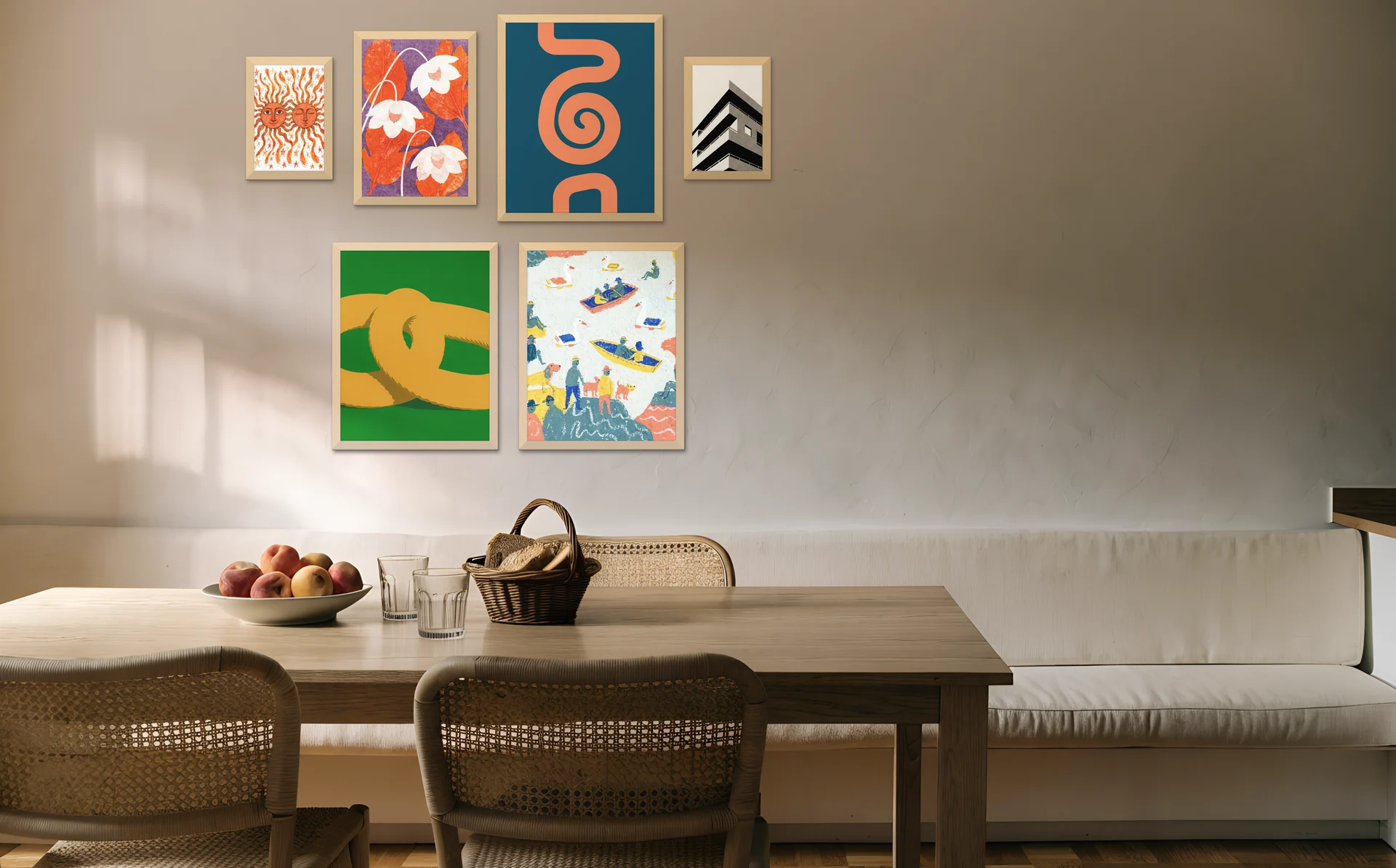
The right gallery wall layout is the one that matches what you already own: a grid if your frames all match, a salon arrangement if your sizes are mixed, a single row for a hallway, a ledge if you rent. There are six layout families worth knowing, and your frames, your furniture and how much planning you enjoy point straight to one of them. This guide compares all six gallery wall layouts so you can choose one, then sends you to the exact spacing, sizing and hanging-height numbers when you are ready to mark the wall.
Most gallery wall advice shows you finished walls and leaves you to reverse-engineer the structure. This page gives you a decision aid instead: a way to look at your wall, your frames and your sofa, and know which arrangement will work before you put a single nail in.
For inspiration sorted by room and style, the gallery wall ideas hub does that job. This page stays in its own lane: which arrangement, and how to pick it.
What are the main types of gallery wall layouts?
There are six common gallery wall layouts: grid, salon (also called organic or eclectic), symmetrical, single row, staircase, and ledge. They differ in how much the frames match, whether balance is measured or judged by eye, and how hard each is to plan. A grid is the most repeatable and the easiest. A salon wall is the most expressive and the hardest.
Everything below is built on those six. Designers use other names for them, and walls often blend two, but once you can place your situation into one of these families you have made the hardest decision already.
| Layout | Look | Best room | Typical frame count | Sizing approach | Planning difficulty |
|---|---|---|---|---|---|
| Grid | Clean, modern, calm | Office, dining, bedroom | 4, 6 or 9 | Identical sizes, identical frames | Easiest |
| Salon / organic / eclectic | Collected, layered, maximalist | Living room, stairwell, study | 6 to 15 or more | Mixed sizes and orientations | Hardest |
| Symmetrical | Traditional, formal, ordered | Above a sofa or bed | 2, 4 or 6 | Matched pairs around an axis | Moderate |
| Single row / horizontal line | Tidy, architectural | Hallway, landing, above a console | 3 to 6 | Often matched, shared centre line | Easy |
| Staircase / ascending | Dynamic, follows the climb | Stairwell | 4 to 9 | Mixed, stepped to follow the slope | Moderate |
| Ledge / shelf | Casual, changeable | Renters, frequent re-arrangers | Open, leaned and layered | Mixed, no fixed plan | Easiest, most flexible |
Grid
A grid uses identical frames at identical sizes with an equal gap between every piece, arranged in even rows and columns. It reads as calm, modern and deliberate, and it is the easiest layout to plan because every measurement repeats. Best for matching sets: a series of botanical prints, a run of black-and-white photographs, a set of four or six related pieces.
Frame count almost always fills complete rows and columns: 4 (two by two), 6 (two by three or three by two), or 9 (three by three). Sizing is the whole point, so every frame matches. Spacing repeats, so one wrong gap shows instantly. Measure the gap once and reuse that single number everywhere.
The grid is the layout to choose when you want the art to feel intentional rather than collected. It suits offices, dining rooms and bedrooms, where order is part of the calm.
Salon, organic or eclectic
A salon wall mixes frame sizes, shapes and orientations, balanced by eye around a central anchor or an invisible centre line rather than a strict grid. It reads as collected and layered, and it is the hardest layout to plan because balance is judged, not measured. Best for mixed art you have gathered over time: a large piece beside small ones, landscape next to portrait, paintings next to photographs.
Frame count runs high, usually 6 to 15 or more, because the density is the look. Sizing is deliberately varied, with one larger piece often acting as the anchor and smaller frames around it. Spacing still matters: keep the gaps consistent even though the frames are not, so the wall reads as one composition rather than scattered pieces.
This is the layout that goes wrong most often, because the balance lives in your judgement rather than a repeated measurement. Compose the whole wall before you commit, either on the floor with paper templates or on a photo of the wall, so you can move pieces around while the cost of changing your mind is still zero.
Symmetrical (pairs, rows, mirror)
A symmetrical gallery wall layout places matched pieces in mirror image around a central axis, so the left side reflects the right. It reads as formal, traditional and orderly, and it sits at moderate difficulty because the matching does most of the work for you. Best for classic rooms and for hanging above a sofa, a bed or a fireplace, where a centred composition suits the furniture below.
Frame count is usually even: 2, 4 or 6 matched pieces. Sizing comes in pairs, so frames mirror each other across the axis. Spacing is even and, like the grid, unforgiving of small errors, because symmetry makes any drift obvious.
A symmetrical gallery wall arrangement is the safe, elegant choice when a salon wall feels too busy and a single piece feels too sparse. It is the most considered of the structured layouts without tipping into maximalism.
Single row or horizontal line
A single row hangs frames in one straight horizontal line, aligned on a shared centre line so the midpoint of every frame sits at the same height. It reads as tidy and architectural, and it is easy to plan because you are working in one dimension. Best for hallways, landings, and the wall above a console table or sideboard.
Frame count is usually 3 to 6. Frames are often matched for a crisp look, though you can vary widths as long as the shared centre line holds them together. Spacing is a single repeated gap between neighbours, which makes this the second-simplest layout to measure after the grid.
The single row is the layout to reach for in narrow spaces and transitional areas. In a long corridor, a row of frames draws your eye along the space as you walk through.
Staircase or ascending
A staircase layout steps frames upward to follow the slope of the stairs, keeping a consistent distance from the treads as the wall climbs. It reads as dynamic and tailored to the space, and it sits at moderate difficulty because you are planning a diagonal, not a flat plane. Best for stairwells, where you step the frames up to match the rise of the stairs.
Frame count is typically 4 to 9, depending on the length of the run. Sizing can mix, and frames often step in a loose diagonal that mirrors the staircase line. Height is measured from the stairs: keep each frame's centre 57 to 61 inches (145 to 155 cm) above the tread directly below it, so the whole group rises at the angle of the stairs.
The slope is the part people get wrong. You are not hanging frames at random heights up a wall; you are following one consistent line. For the exact way to set that line and the height to centre each frame as you climb, see how high to hang a gallery wall, the canonical guide for hanging height. On a narrow staircase, use acrylic rather than glass, because frames there get knocked.
Ledge or shelf (few holes)
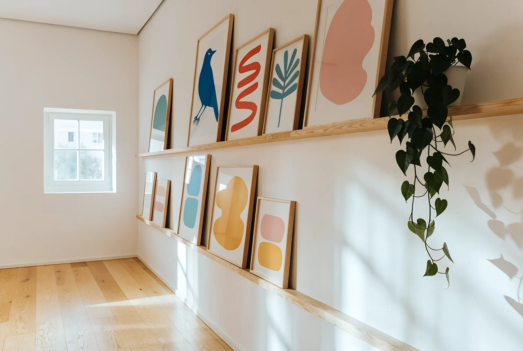
A ledge layout leans framed art against a narrow picture shelf and layers pieces front to back, with no fixed hanging plan. It reads as casual and relaxed, and it is the easiest and most flexible option because only the ledge is fixed; the frames just lean. Best for renters, for anyone who likes to re-arrange, and for people who are still collecting and do not want to settle on a final composition.
Frame count is open: a ledge holds as many pieces as it is long, and you can overlap them. Sizing is freely mixed, with larger pieces at the back and smaller ones leaning in front. There is no spacing rule to follow, because you slide frames along the shelf until they look right, then change your mind next month at no cost.
A picture ledge keeps the whole arrangement movable: only the ledge is fixed, so you re-arrange the frames whenever you like. If you rent, or you buy art faster than you settle on a final arrangement, this is the layout to choose. Before you fix the ledge in a rented home, get your landlord's permission in writing: it still means a few holes, just fewer than one per frame.
Which gallery wall layout should you choose?
Choose your layout from what you already own and where it is going. If your frames match, build a grid. If your sizes are mixed, go salon. If you want formal order above a sofa or bed, go symmetrical. If the wall is a hallway or sits above a console, use a single row. If it is a stairwell, follow the staircase. If you rent or like to re-arrange, lean everything on a ledge.
Run down this list and stop at the first line that fits:
- Frames already match. Choose a grid. The matching is done, so let it repeat.
- Mismatched sizes. Choose a salon arrangement. Mixed sizes and orientations are a feature here, not a problem to solve.
- Formal and balanced. Above a sofa, bed or fireplace, choose a symmetrical layout in matched pairs. If the wall has no obvious centre to mirror around, an asymmetric arrangement balances by visual weight instead.
- Hallway or console. Choose a single row on a shared centre line.
- Stairwell. Choose a staircase that follows the slope of the stairs.
- Renting or still collecting. Choose a ledge. It takes a few fixings for the shelf and none for the frames; if you rent, get permission in writing first.
If two lines fit, pick the easier one. A grid or a row will get hung this weekend. A salon wall is worth it, but be honest about whether you will actually compose it or leave the frames by the skirting board for a month. These are the layout families that anchor most gallery wall layout ideas you will see, so once you have your family you can browse for the look without second-guessing the structure.
The rules that apply to every layout
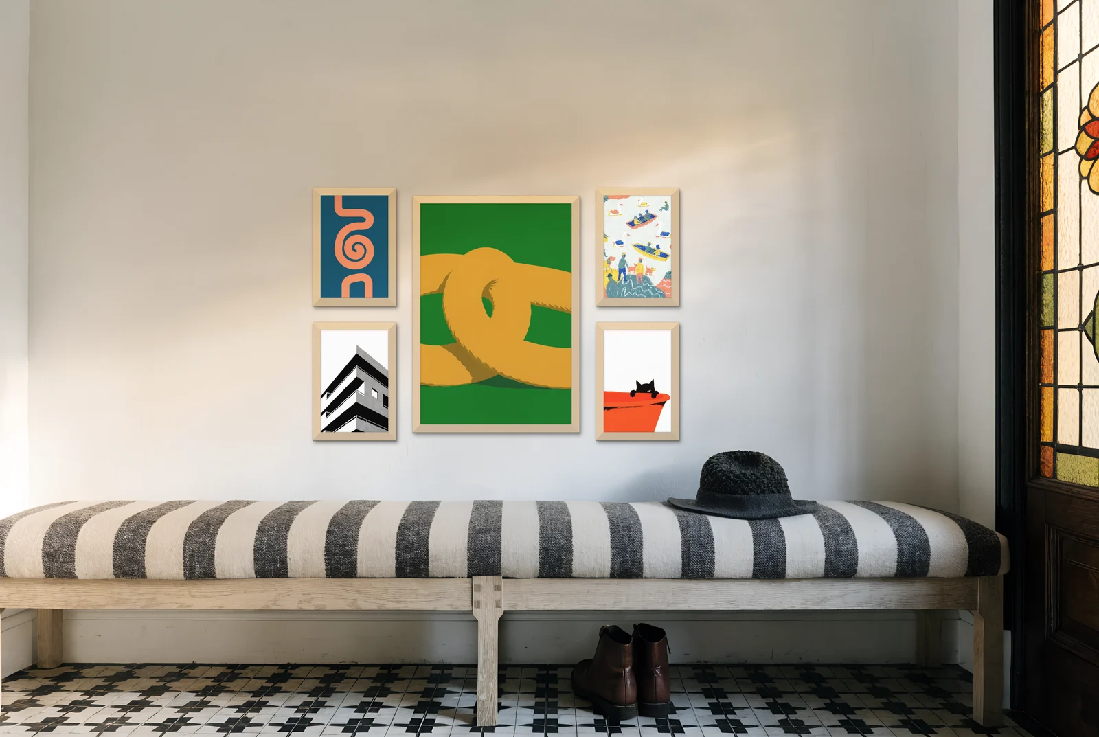
Three numbers hold across the hung layouts: keep a consistent gap of 2 to 3 inches (5 to 7.5 cm) between frames, let the whole group span roughly 66% to 75% of the furniture below it, and centre the composition at eye level. Get these right and even a simple row looks considered. Get them wrong and the most ambitious salon wall looks off.
These mechanics each have a canonical guide, so this section states the rule and points you to the detail rather than repeating it.
Keep the gap consistent
Use the same gap between every frame, and keep it in the 2 to 3 inch (5 to 7.5 cm) range. The gap is what makes a group read as one piece rather than scattered frames, and consistency matters more than the exact figure. Tighter gaps suit dense salon walls and grids; the wider end suits airier rows. For the full spacing logic, including how to space frames of different sizes, see gallery wall spacing, the canonical guide for the gap.
Match the group to the furniture below
Size the whole arrangement to span about 66% to 75% of the width of the furniture it sits above, according to interior resource MontCarta, so the art relates to the sofa or console instead of floating above it. For the exact widths, how many frames that takes, and at what sizes, see gallery wall sizes, the canonical guide for frame sizing and counts.
Hang it at the right height
On an empty wall, centre the whole group so its midpoint sits at 57 inches (145 cm) from the floor, the usual eye-level height. Above furniture, the same idea applies but you measure from the furniture, leaving 6 to 8 inches (15 to 20 cm) above the sofa or console, measured from the top of the back or the cushions, whichever is higher. The full method, including the 57 inch rule and the staircase slope, lives in how high to hang a gallery wall.
For the whole sequence from measuring your wall to marking the hanging points, how to plan a gallery wall walks through the process end to end.
Test the layout before you commit
The cheapest way to compare layouts is to try each one before you touch the wall. Cut paper templates to the size of your frames and tape them up, or lay everything out on the floor and photograph it. Either way, you are checking the arrangement, the gaps and the overall width against the real space, not guessing and re-drilling.
This is the step that separates a wall you are happy with from one you keep nudging. A grid that looked balanced on paper can sit too high above the sofa once it is up. A salon wall that felt crowded on the floor can open up once the gaps are even. Seeing it at real size, in the actual room, is the test that matters.
If you would rather skip the tape, this is where Curate helps: you upload a photo of your own wall and try each layout against the room. The planner can snap frames into a grid or a single row and keep the gaps even, so you see the arrangement on your actual wall before you commit. It is free to plan, and you can preview the result on your phone.
Frequently asked questions
What is the easiest gallery wall layout to plan?
A grid is the easiest, because identical frames at identical sizes mean every measurement repeats, so you set one gap and reuse it. A ledge is the most forgiving of all, since only the ledge is fixed to the wall and you slide frames along the shelf until they look right.
How many frames do you need for a gallery wall?
It depends on the layout: a grid usually uses 4, 6 or 9 frames, a single row 3 to 6, and a salon wall anywhere from 6 to 15 or more. For how many frames suit your wall and furniture size, see our gallery wall sizes guide.
What is a symmetrical gallery wall layout?
It is an arrangement of matched pieces mirrored around a central axis, so the left side reflects the right, usually in pairs of 2, 4 or 6 frames. It reads as formal and ordered and works well above a sofa, bed or fireplace where a centred composition suits the furniture.
Can you mix frame sizes in a gallery wall?
Yes. Mixed sizes are the defining feature of a salon or eclectic layout, where one larger anchor piece is surrounded by smaller frames. The trick is to keep the gaps between frames consistent even when the frames themselves are not, so the wall reads as one composition.
How wide should a gallery wall be above a sofa?
Size the group to span roughly 66% to 75% of the sofa's width, so it relates to the sofa rather than floating above it. See gallery wall sizes for the exact widths and how to hit them with your frames.
Pick your layout family from the list above, then find it among the 60+ gallery wall layouts in Curate and try it on a photo of your own wall before you mark a single hole. Lay your frames out, snap them into a grid or row, keep the gaps even, and you will know it works before the first nail goes in.